A poetry collection is small in print run but large in meaning. If you want to have your poetry collection printed, it comes down to the details: the right format, calm typography and a careful finish that does justice to your poems. Here you can read what to look out for.
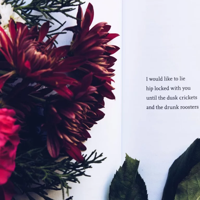
Format and paper
Poems come into their own in a compact format, for instance A5 or a slim format. Choose uncoated, woodfree paper for a warm, literary appearance and comfortable reading. A cream paper shade reinforces that feeling.
Binding and finishing
- Softcover, glued: economical and suited to small print runs.
- Section sewn: more luxurious and sturdier for a special edition.
- Soft-touch or matt lamination: a velvety, understated cover.
- Generous white space: lets every poem breathe.
Typography: the silence on the page
When having a poetry collection printed, the layout is at least as important as the cover. Give the poems room: white space lets a poem breathe and strengthens its effect. Start every poem on a new page and keep the line breaks exactly as you intended them, because in poetry every blank line is a choice.
Supply as a PDF with embedded fonts, so that your careful layout is preserved exactly.
Print run and publishing
Thanks to printing from a single copy you can start small: a handful of collections for yourself and loved ones, or a larger run to sell at readings and in bookshops. If you want to sell your collection through shops, you need an ISBN. See the International ISBN Agency. Have a look at our page to have your poetry collection printed straight away.
Feel free to start small. A first run of ten to twenty copies is enough to let people read it, to perform from and to find out what people think; you can always reorder afterwards. Do bear in mind that each edition needs its own ISBN: a paperback and a hardcover of the same collection count as two different editions.
Line breaks and hyphenation: where it goes wrong
In poetry the line break is the form. A line that wraps to the next one in the layout changes the poem. So choose a text frame wide enough for your longest line and switch off automatic hyphenation. If you work with a fixed indentation pattern, use tabs or indents instead of spaces; spaces shift along if the font turns out slightly differently in the PDF.
Preferably put every poem on its own page, even if it only has eight lines. The white space around it is part of the reading. If a long poem does run across two pages, break between two stanzas and never in the middle of one. And keep the left margin of all poems the same, so the collection looks calm when you leaf through it.
What else belongs in a poetry collection
- A colophon with your name, the year, the designer and possibly the ISBN and the printing house.
- A table of contents with the titles or first lines, certainly if the collection has more than twenty poems.
- Endpapers with a hardcover: a coloured endpaper instantly lifts a thin collection.
- An acknowledgement if poems appeared earlier in a magazine.
Finally, bear in mind that a collection is often thin. Below fifty pages the spine is too narrow for legible text; choose a saddle-stitched finish then, or leave the spine blank. If you still want a hardcover, paper with a high volume helps to give the book the thickness you want.
Frequently asked questions about having a poetry collection printed
Which format suits a poetry collection?
A compact, understated format such as A5 or smaller matches the calm that poetry asks for and sits nicely in the hand.
Can I have a small run printed?
Yes. We print from a single copy, so you can start small and reorder later if you need more.
Do I need an ISBN?
Only if you want to sell your collection through bookshops or online stores. For personal use or giving away, no.