A screen sometimes lies: colours and detail come across differently on paper than you expect. A proof is a physical sample copy with which you see exactly how your book will look, before you have the whole run printed. With colour and imagery in particular, that is worth it.
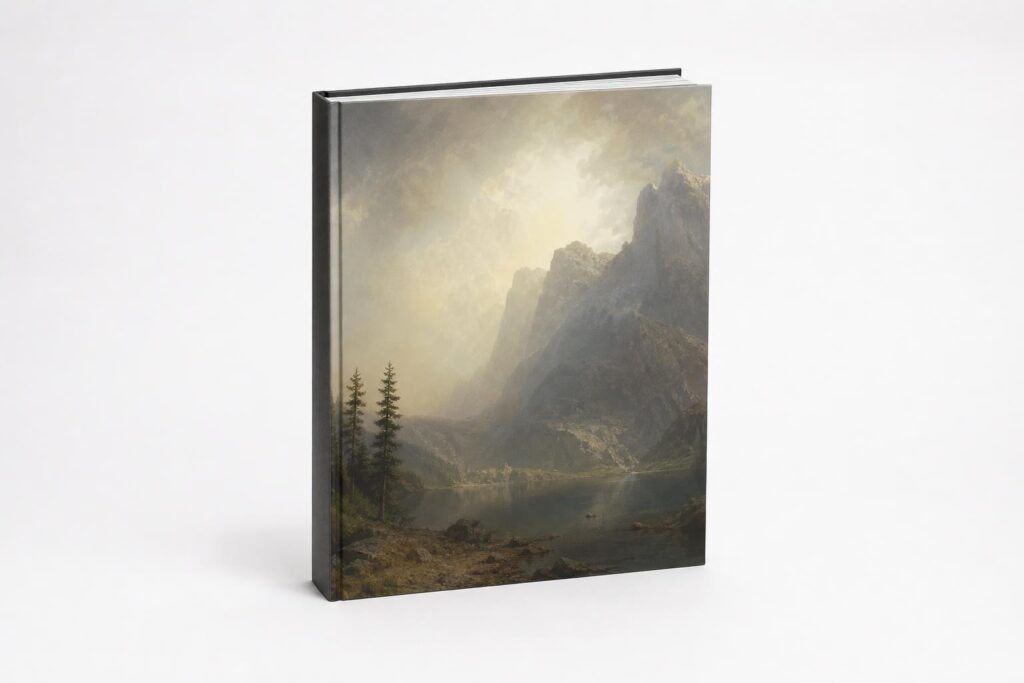
What is a proof?
A proof is a physical sample copy (or a few pages) produced before the full print run. With it you check colour, sharpness, paper and finishing, exactly as the end result will be.
When should you request a proof?
- With large print runs, where a mistake is expensive to repeat.
- With colour-critical work such as art books and photo books.
- With special papers or finishes you do not know yet.
- If you are unsure whether your files are built correctly.
What does a proof cost?
A proof costs a little extra and some time, but prevents a misprint of the whole run. For valuable printed matter it more than pays for itself. At PrintItEasy you can simply add a proof to your order.
What do you check on a proof?
Pay particular attention to the colours: do they match what you had in mind? Look at whether dark areas are even and whether photos come across sharp. Also check the margins, the binding and whether text does not disappear into the fold. You can read more about the colour difference between screen and print in our article on CMYK vs RGB. For more background on colour management you can turn to the International Color Consortium.
Digital proof or printed proof?
Not every check calls for paper. A digital proof is a PDF on which you check layout, page order and text; you get it quickly and it costs nothing. What you do not see on it is how the ink behaves on your paper. A printed proof does show that: the colour depth, the sharpness of small text, how matt or glossy the cover feels and how the book sits in your hand.
Rule of thumb: if it is about text and the layout is straightforward, the digital proof is enough. If photos, illustrations or brand colours are central, or if you do not know the chosen paper yet, go for a physical proof.
How to judge a proof properly
Look at your proof in daylight, not under a warm lamp: artificial light turns paper yellow and you then judge your own design too harshly. Lay the proof next to a printed example you like rather than next to your screen, because a screen emits light and paper reflects it. That difference cannot be argued away.
- Check whether dark areas are even and not blotchy or dull.
- Keep an eye on skin tones; they give away a colour cast fastest.
- Check whether small text and thin lines are sharp, certainly in colour.
- Check the position of the spine text and whether nothing disappears into the fold.
If something is off, say as concretely as possible what you want changed: “the sky on page 12 may be warmer” helps us more than “the colours are wrong”. On that basis we adjust before the run goes on the press.
Frequently asked questions about a proof
What exactly is a proof?
A physically printed sample copy on the same paper and with the same technique as the run, so that you see in advance how your book really turns out.
When do I need a proof?
Above all with colourful work such as photo books, with larger print runs and with editions that have to be perfect, such as a gift.
Does a proof cost a lot?
A proof costs a little extra, but far less than a misprinted run. Because we print from a single copy, it is simply a run of one.
How long does a proof take?
Count on a few extra working days: the proof is printed and shipped, and after that you need time to look at it calmly. Plan that room into your deadline and you will not have to rush the assessment.
Can I still make changes after the proof?
Yes, that is what a proof is for. Small corrections in colour or layout are processed before the run is printed. Major content changes are possible too, but then a second proof is often wise.